Estimated reading time: 5 min
A conversation with Luca Aldrighi about the Sanko Headquarters development.
We sat down with Luca Aldrighi, RMJM Milano’s Director, to discuss the insights and concept design for the project development of the Sanko Headquarters in Istanbul, Turkey. The project was inspired by the fairy chimneys and caves in Cappadocia, drawing from cultural and historical elements. As the Director, Luca was able to share with us his take on the challenges and rewards of this unique project.

How did you come up with the idea for this project?
L: We based our idea around the client’s two main requirements: create something that needed to be a stone-dominated podium also connected to its cultural roots and surroundings. Therefore, instead of designing a traditional tower layout made entirely of glass where you have the podium and the simple elevation on the floor plan, we decided to use stone as the main material and as a unique solution of continuity. In all our projects, we want to bring the element of surprise. Usually, when you see a building from the outside, your mind is already creating an idea, an image, an expectation of what you are going to see once inside. However, when you enter, the idea you had built in your mind changes and takes another shape. For example, the Inner City proposal we did in České Budějovice is an O-shaped building. From the outside, it looks very plain/simple, almost dull, some would say. However, when you enter the piazza, the facade has different colours and shapes changing the visitor’s perspective.
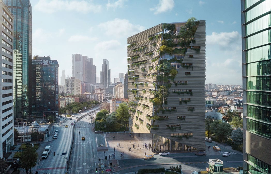
A monumental piece of rock from the exterior and a void from the ground opening up into the sky in the interior: that is the element of surprise. The visitor is often curious to discover what’s inside, travelling like a modern Indiana Jones.
Why did you decide to create the design’s concept around the caves of Cappadocia?
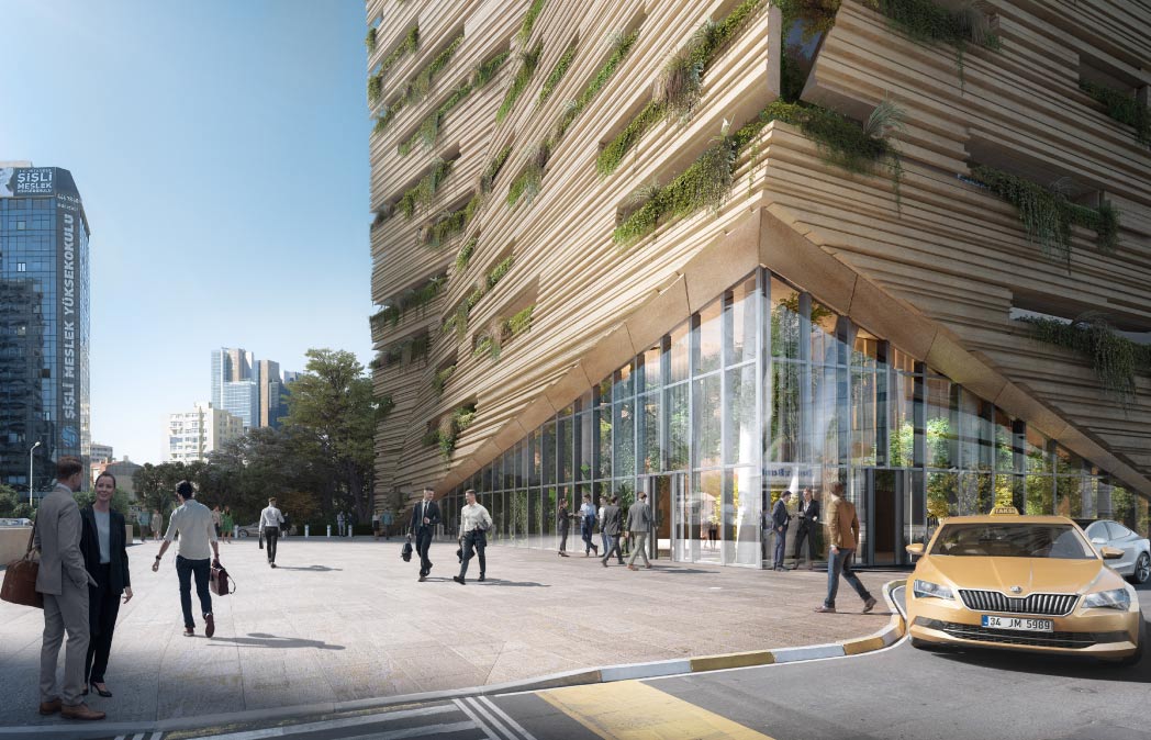
L: We wanted to make a connection with the local culture, getting inspired by the vernacular architecture of the fairy chimneys that are the result of the erosion of the rock. When designing the building we thought of a two-faced concept: one side consists of an element – the stone – solid and rigid. The other represents flexibility, stretched and modelled by the forces of nature. The building appears to rotate into the corner, creating a dialogue with the surroundings, a language that results from the harmonious blending of these two elements.
We treated natural light as a construction material not just to bring sunlight to highlight some features, but to use it as an element itself. Similar to the fairy chimneys of Cappadocia, the striking beauty of this building is when natural light hits the escalated podium.
What were the most challenging aspects of the design?
L: The most challenging part was about transmitting feelings. We needed to consider what it means to design an office tower nowadays and the crucial elements and feelings we wanted to transmit. The challenge was to imagine an office tower different from what we are used to seeing. When you enter this building, the first thing you think about is to have respect, to whisper instead of talking, to drift instead of hurrying and enjoy your visit instead of leaving.

How do competition designs differ from other architectural bids and commissions?
L: Competition designs are more complicated because you do not have any direct contact with the client. You have to analyse and study the client’s wishes and company while understanding the culture. Whereas during bids and commissions, you develop the project directly with the client, since you have been specifically required for the project. Even though they invite you to the competition, meaning that they were interested in the quality of your work, you still have to prove that your proposal is worth it. That is why you have to start from a strong concept and keep it as your guideline. During the design process, you will have doubts and questions about the direction to take, but this can be avoided by sticking to your original principles.
What is the most rewarding part of the Sanko Headquarters project?
L: Explaining the project to the client and seeing they truly understood what we wanted to represent. Of course, everybody likes to win, but seeing the client’s face in the meeting and sharing a deep understanding with them is the best part. It means our design carries meaning. Having this ability to reach people that are not part of the architectural world and still share a deep understanding with them is a brilliant feeling. If our message is accessible and gets to everyone, that is the best reward for us architects.
How much of the post-pandemic office culture did you take into account when designing this project?
L: Most people are hesitant to go back to work post-pandemic. We are trying to re-imagine the set idea of an office building, creating a milestone for future developments. We took into account the discussions about using natural light instead of artificial. We wanted to create a space where people can feel inspired, a place where they enjoy working.
Moreover, the use of greenery in the inner balconies, together with the natural stone, will help clean the air, making people at ease both physically and psychologically. In general, we create highly flexible buildings that have qualities to offer and do not function only as spaces. We want to keep being as innovative as possible, with a clear idea in mind, evolving with the times and creating experiences that address people’s needs.


