Estimated reading time: 5 min
RMJM Milano’s Director, Luca Aldrighi, sat down with us to talk about his studio’s latest project, the Beach Plaza Monte Carlo. As the Director, Luca shared his take on the challenges and rewards of this unique project, the primary sources of inspiration, and what it means to design a project during the Covid-19 pandemic.
What inspired the idea for this project?
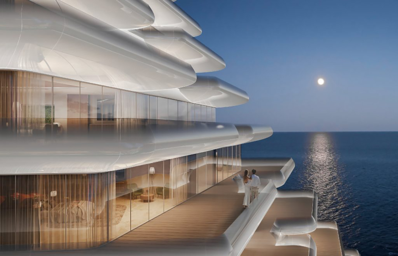
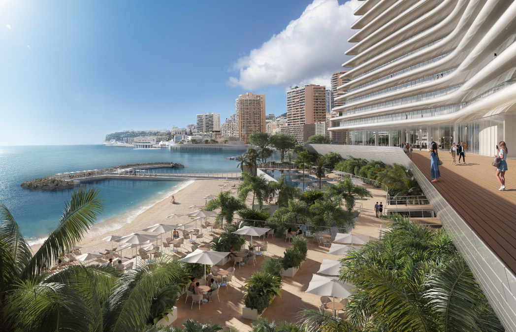
L: Our primary source of inspiration was the proximity to the sea. We wanted to create a project connected to the surrounding landscape and give a complete experience to the guests. Thus, we designed a building close to the water that would give the idea of a ship ready to sail. Indeed, the central podium consists of a base of 2-3 floors, coated in photocatalytic polished white ceramic, representing a ship’s keel, where the restaurants and the public area are located. Meanwhile, the two main blocks ‒ the guest rooms and the flats ‒ are connected by the boardwalks/gangplanks, giving the idea of the bridge of a ship.
Furthermore, these two blocks face each other through a vertical linking, the glass lifts, which are not just the means to move from A to B but also provide the customer with a fresh experience. The customers/guests can see the vegetation and the sea in the background from the windows, making for a pleasant lift ride. The last podium, with the spa & wellness amenities, an infinity pool, and a bar/restaurant on the beach, is separated from the rest and represents the ship’s port. Finally, if you take a closer look at the balconies, they are curved and are treated with glass, of which the inside consists of tiny spheres of ceramic. From a distance, it looks like it’s white, but from a closer look, it’s transparent and looks like a whale’s belly, offering a sense of protection.
What were the most challenging aspects of the design?
L: When you design a hotel, you are not working with only the guest rooms. Nowadays, you also need to consider the spa & wellness area, the restaurants, lobbies, conference rooms, all with their respective functional spaces such as laundry, drop off, and loading zones. With all these amenities and 400 guest rooms, the project also includes 20 flats, each with its own lobby. That’s what the most challenging part was: to create a building with all these functions working efficiently and in harmony, and in a reduced space ‒ there’s only a thin strip of land facing the sea.

How much of the post-pandemic office culture did you consider when designing this project?
L: Nowadays, you have to consider the post-pandemic culture for everything and every type of project as our approach to daily stuff has indeed changed. Since the beginning, Covid-19 has been present; we have tried to create a hierarchy of public spaces, even more significant than usual. We have designed them bigger ‒ from the private areas, such as the balconies mentioned above, to semi-public and shared, such as the spa & wellness area. For instance, suppose you check the volume of the spa roof. You will notice various isolated sitting rooms designed to accommodate a small number of people while also guaranteeing social distancing.
What do you think is the greatest challenge for designing in sustainability? How did you integrate green design strategies in this project?
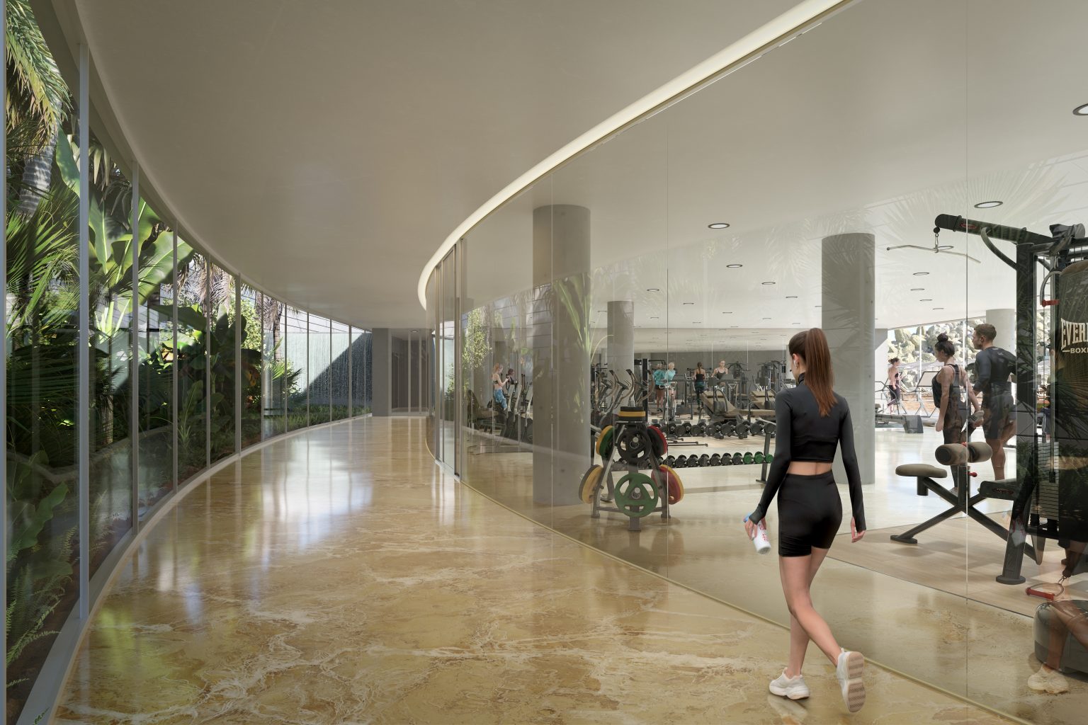
L: Sustainability means a lot of things, and for this project, we approached it differently than we have previously done, such as for Sanko Headquarters. The client’s brief was not to obstruct the sea view from the surrounding buildings. Hence, we created a pyramid-shaped structure with a space in between that would allow for lots of greenery while also guaranteeing that unobstructed view. Sustainability means also ensuring this connection with nature, which customers and guests are looking for. For this project, sustainability guarantees a visible impact on the city and landscape. Each of the amenities, which aren’t exclusively for the hotel guests, consist of giving the user experiences they wouldn’t generally provide if their closeness to nature hadn’t been upgraded. Even when designing the boardwalk outside the gym, instead of creating a simple, four-walled hallway, we decided to design it with a glass wall that faces the beach and greenery. Moreover, as mentioned above, using wooden flooring and creating open spaces that allow for a sea breeze to come through, we recreated the feeling of a sailing ship, thus the Beach Plaza’s closeness to the sea.

What part of the design process are you most proud of? What part of the Beach Plaza was most rewarding?
L: Each process has exciting aspects. There’s the technical aspect ‒ including circulation, parking, service rooms ‒ and design ‒ such as the layout of each guest room and their bathrooms. We designed the latter to represent little private spas while connecting with the space and balcony, allowing for a fusion amongst the three. Every little thing has more than one functionality. Again, an example is the choice of materials. The glass and ceramic used for the balconies show a changing appearance, depending on the day the light hits the terraces. Everything, from the technical layouts to the more aesthetical designs, reproduces a feeling of perpetual movement as if the building is ready to take sail. If you have great conceptual ideas but don’t make them functional and beautiful, they only remain drawings. That’s what an architect has to do: translate a philosophical, abstract idea into a practical design/project. And that’s where we focused our effort.
What did you see as the critical issues or considerations when designing this project?
L: When designing any project, we consider creating a deep connection between the technical elements and the local environment, culture, and art. You have to take into consideration each of these aspects. A project you create in Dubai won’t be the same as the one you would make in Northern Europe. When we designed Sanko, for example, we wanted to show both detachment and connection between the outside and the inside of the building. From the outside, it looks like a castle made of rocks, while from the inside, it is a world within itself.
On the other hand, the Gdynia Mixed-Use Development is in a fishermen’s city (Gdynia) in Poland. We wanted to homage the city’s history, using marine architecture, such as the towers that look like sails blowing in the wind and the offices representing the ship’s point, protecting the rest of the building. From the visible to the invisible elements, we wanted to suggest the connection to the city history and give homage to whoever created the city, giving it its identity. It’s the architects’ job to learn how to make the most and build a relationship with the surroundings.


