Estimated reading time: 3 min
Buildings as brand icons.
If someone is talking about branding, they are referring to marketing and business. But branding is more than that. Branding consists of promoting a company through the characteristics that set it apart from its competition. Architecture has therefore a fundamental role to play in promoting brands.
Brand icons, such as companies’ headquarters and other buildings, have increased in popularity over the decades.
According to Katie Stamp, head of the graphics at SODA studios, “a building is a brand as well”. Even though branding and architecture are two different disciplines, they work based on the same principles, such as the focus on the user experience and how people are going to use a specific space. For highly branded companies, designing a new building is an opportunity to showcase their values by enhancing the experience of being inside that specific building.
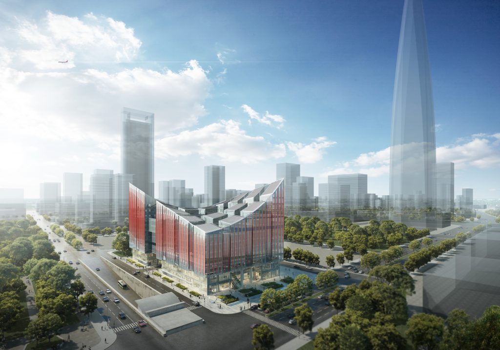
The Ningbo Fashion Creative Centre presents a clear example of innovative branding. Designed by RMJM RED, the building -still under construction- has been at the heart of the centre’s brand image. The curved shape of the building has even been used to create the centre’s logo. The NFCC will become a commercial, experiential, artistic and forward-looking urban industrial building.

[Image description: The image consists of a render of the Ningbo Fashion Creative Centre, coloured in red, and surrounded by trees and renders of other tall buildings.]
Google is another popular example. The company is considered the first to have started using its headquarters to show off the brand and its values. Its offices include swimming pools, free gourmet food canteens, gyms, games rooms and so on. This has allowed for the employees’ experience to become remarkable.
Other tech companies, such as Apple, have taken inspiration from Google and nowadays their offices are a mirror of the company’s core values. When walking through an Apple office, for instance, one witnesses the reflection of the company’s brand and style. From the classic glass windows to the minimal and elegant design and the polished surfaces. Nonetheless, many have reported that it is not a comfortable design for employees to work in. Indeed the Apple offices are presented to us as more of a product, than a building itself. Back in 2013, the company obtained a trademark for the design and layout of their stores, including the disposition of the recessed lights and their colours.
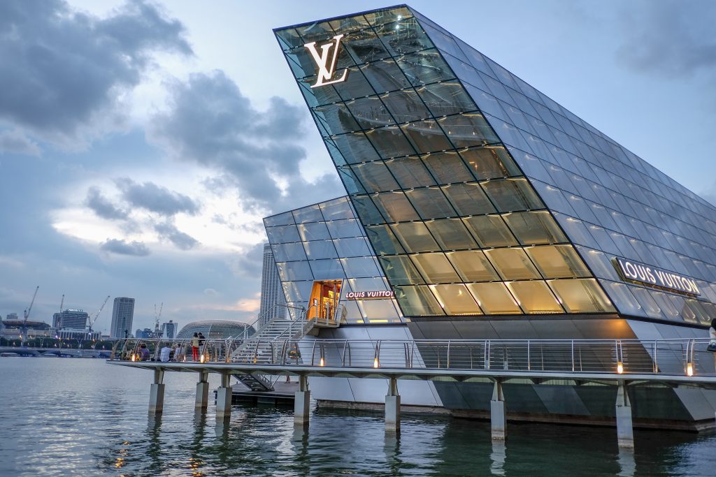
Another technique companies have been using is architectural lighting. By upgrading the lighting at their headquarters, using explicit signs and implicit symbols alike, companies have successfully achieved brand representation. Authentic branding is achieved through the use of luminous facades paired with a consistent interior lighting design. For instance, striking colours are successfully used for gaming companies buildings, whereas banks or fashion designers use more delicate, subtle colours.

[Image description: the Louis Vuitton building in Singapore. It is an oblique building that shows the signature LV and the lighting in the classic colours of the brand.]
On the one hand, brand icons represent an outstanding achievement. Companies can advertise their brand not only through their products but also through their buildings, setting their successes, values and mission in stone. With progress comes innovation, and innovation in architecture can translate into many things.
On the other hand, when branding and appearance become more important than user experience, we risk losing sight of who the building was designed for: the brand’s employees.
The same could be said about the lighting techniques. A lighting experience, such as the media facades, could move too far from the initial aim of enhancing the brand identity. To avoid this, companies should consider implementing interior lighting that reflects the exterior design of their buildings, choosing natural over artificial light, being careful to maintain consistency throughout the whole building.
Through the increase in the number of illuminated buildings and brand icons, architects are moving from the traditional “one form, one function” towards a more innovative approach. However, we should be careful in remembering that even if branding is successful it needs to be treated carefully. By keeping in mind the importance of sustainable and user-friendly design we ensure that one does not take priority over the other.


