Estimated reading time: 2 min
10 Minutes With Luca Aldrighi
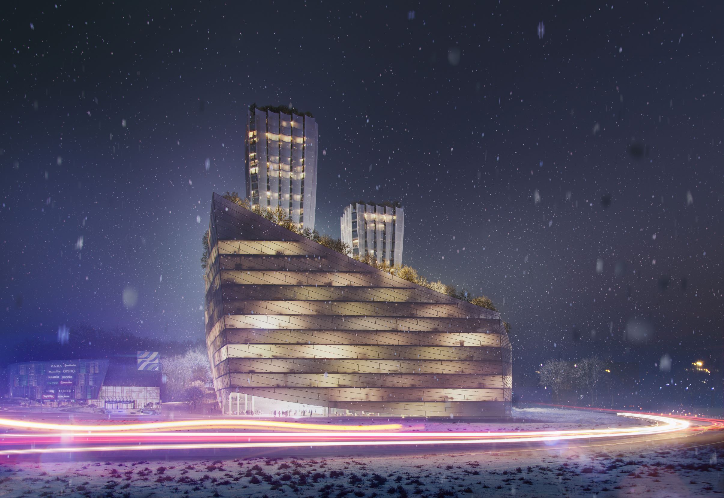
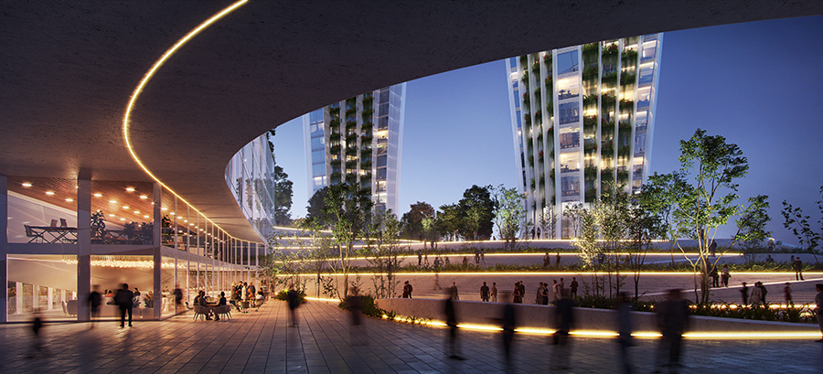
In this quick-fire interview, Luca Aldrighi offers us some insights into the concept design for a new mixed-use development in the Polish seaport town of Gdynia. The project was designed as a tribute to the founding fathers of the city, who were fishermen, as well as the city’s marine architecture. This theme is woven into the 4 main features of the Gdynia project: the towers, office building, piazza and podiums. As the Design Director at RMJM Milano, Luca was able to share with us his take on the challenges and rewards of this unique project.

Why did you decide to create the concept of the design around the town’s fishing history?
L: The Gdynia project needed to stand out as a landmark and redefine the landscape of the city. Most solid concepts are ones that are rooted in a project’s surrounding community and this particular community was founded by a collection of fishermen, so it was clear to my team that the design had to revolve around the sea and fishing.
What were the most challenging aspects of the design?
L: We focused heavily on marine architecture in the design, but there is no incorporation of water in the landscaping of the development. The size of the site was relatively small once the buildings were included in the area plan, so this was not going to be possible. We also found challenges in determining the height and shape of the towers to ensure that they didn’t block out sunlight to surrounding structures but were still elegant and gentle and looked at home in their surroundings. One of the ways we addressed this was by introducing a number of tilted surfaces to help reflect the light, which projects an ethereal ambience around the site.
What part of the design/competition process are you most proud of? What part of the Gdynia project was most rewarding?
L: The greenery. It wasn’t a purely academic exercise or an aesthetic effect directed by the latest fashions. The recent COVID-19 experience that we are living through has taught us how important outdoor spaces are to human strength and resilience. Recent studies carried out by the University of Warwick proves the importance of access to green spaces, as those with easy access to them have enhanced creativity, better coping mechanisms for mental illness and strengthened immune systems. We took this design as an opportunity to create a number of focal green spaces. Every apartment in the development was designed with its own private terrace, even the smallest ones. The office building was designed with a series of stepped terraces, to ensure that people at work could have a visual escape into the greenery.
On a separate note, we thoroughly enjoyed working with Pictown to create the renders for this project. Having such artistic visuals to present really elevates a project from interesting to extraordinary.
How do competition designs differ from other architectural bids and commissions?
L: You must be a good listener because you don’t have the same communication channels with the client. This means you have to really analyse the historical, technical, cultural, financial and economic information you are provided with to fully understand the context in which the proposal is situated. I also think that talking with the local community is even more important in these sorts of projects as they likely have the answers you are looking for if you can ask the right questions.
Feeling lost is also a frequent sensation during competition designs, as your usual channels of communication and therefore direction are cut off. Therefore it is important to establish identifiable milestones for the project, they can become the principles that help direct you and keep you on the right track. I think a lot of architects get overwhelmed during competitions because of this increasing pressure to design something ‘cool’, but that often isn’t what competition clients are looking for, it’s about designing something that withstands the decades, not falling out of fashion before construction is even complete.


